portfolio

5 REASONS I CHOOSE SQUARESPACE

The Homepage offers a slideshow gallery that advances automatically and displays photographs that do not appear anywhere else on the site. UPDATE: October 22, 2015. Added an additional category and Homepage now features a photo from each.

The Homepage offers a slideshow gallery that advances automatically and displays photographs that do not appear anywhere else on the site. UPDATE: October 22, 2015. Added an additional category and Homepage now features a photo from each.

Until the move to Squarespace, I was a hand-coder. Yes, I can admit it, I hand-coded my website. Even over many years and many iterations of jfwphoto.com I continued to hand-code. Most recently it was a fairly simple site, one page deep and featured a java slideshow, my twitter feed and links to everywhere else you could find my work. It wasn't horrible, but it also wasn't anything I was particularly proud of or special and more to the point, I wasn't really driving anyone to the site.

I realized a while ago that it was time to get serious and finally have a website that I actually wanted to share with others and for that reason I made the move and relaunched my presence on the web.

Here are five reasons I made the switch from hand-coding to Squarespace.

1. One location for everything. It gives me a true presence, one URL, that I can now share which will highlight my photography, provide some information about myself, AND still provide a launching point to social media. There is still one BIG thing I have not yet moved, though. This blog. I do plan on eventually incorporating it and Squarespace offers step-by-step instructions on how to transfer most popular publishing platforms, including Blogger, into their framework without breaking links, etc. I just need a little more time.

I'm using the About page to also provide links to tear sheets and my affiliate links. 

I'm using the About page to also provide links to tear sheets and my affiliate links. 

2. The content management system. I'm already an admitted hand-coder, therefore I know HTML and can build a website from scratch, but the reality is my skills will only allow me to build sites circa 2005. The web is so much more dynamic these days and having the ability to update a site quickly and easily was important to me. Squarespace makes it easy through their CMS and once you understand how it works, you can update or make changes in only a few minutes. I admit that I dove right in during the two-week trial and became a bit frustrated. However, once I took a step back, watched some tutorials, and looked at other Squarespace sites that used the same template I choose, the process of building my site became very easier. 

3. A wide selection of templates. The first thing that drew me to Squarespace was seeing other photographers using the platform. I liked the variety of templates, how most designs were clean and simple. One downside to temples, of course, is that all sites can begin to look the same. To make your site stand out, Squarespace gives you the ability to use custom code which I've started to incorporate and eventually is what I hope will make my site stand out. Also, switching between templates, even after your site is built is really easy to do and makes it possible to experiment with different looks.

This is typical of my gallery pages where I offer both navigation arrows and thumbnails. However, the commercial gallery seen here is the only place I offer full caption information on every photo.

This is typical of my gallery pages where I offer both navigation arrows and thumbnails. However, the commercial gallery seen here is the only place I offer full caption information on every photo.

4. Mobile devices. While I don't have current metrics on jfwphoto.com as proof, it is my belief that most people will be accessing my site on their phones or tablets. While not always ideal, having a website that scales and displays properly on a small screen is critical. Squarespace does a really nice job with this and I love how it looks on my Samsung phone and Apple iPad 2. I already have shared my site with others in this manner. 

5. Support. Let's face it, it's nice to be able to call someone when you have a problem. It's also nice to be part of a user base that offers inspiration, advice, problem-solving and provides customization tips when needed. Squarespace is well established, hasn't stagnated and continues to be one of the leaders in providing website services to photographers and other creative people.

With all the previous versions of my site, I would build it then and mostly forget it. However, with Squarespace I find myself revisiting every couple days, making small changes, or adding more photographs, or experimenting with styles. Why? It's easy.

And that's what it really comes down to after all, ease. A website that doesn't change or one that you don't use because it is too hard to update is a waste of a URL and does nothing to promote you or your photography. So stop putting it off and give Squarespace a shot.

THE RELAUNCH OF JFWPHOTO.COM

The homepage of jfwphoto.com using the Squarespace Ishimoto template.

The homepage of jfwphoto.com using the Squarespace Ishimoto template.

It's taken much longer than it should have, but I relaunched jfwphoto.com using Squarespace and finally have everything in one place*.

I've been thinking about this for years and now that the new jfwphoto.com has been public for several weeks and I've had the chance to work and refine it, I'm glad that I did this and question myself as to why I waited so long.

In a subsequent blog post, I'll go into the details on why I choose Squarespace and offer some insight into the process along with my experiences in building the website, but for now, I hope you take some time to view my site, offer some feedback, and most importantly, ask questions.

Landscape gallery page using slideshow with Show Thumbnails and Show Next and Previous Controls selected. I'm still trying out various gallery styles.

Landscape gallery page using slideshow with Show Thumbnails and Show Next and Previous Controls selected. I'm still trying out various gallery styles.

If you are thinking about using Squarespace, they offer a full week 14-day free trial with no credit card required. I would also recommend you watch a few of the tutorials.

*Everything except this blog. Also, I currently have a redirect on the domain jfwphoto.com through GoDaddy. Both of these will change.

UPDATE: On October 20, 2015, Blog was incorporated into this site and Domain was switched.

INSPIRATION vs. INTIMIDATION

While some family and friends might provide honest feedback, at some point you will need to leave your comfort zone and seek professional critiques if you hope to grow.
As I was thinking about this blog post I came across a quote in Guy Kawasaki's book APE: Author, Publisher, Entrepreneur-How to Publish a Book. While Kawasaki is talking about writers, I easily substituted photographer and it wrapped up something that I have thought about often over the years.
"Don't let successful writers [photographers] awe you. ...it's OK for you to admire them for the quality of their writing [photography] or their success. However, don't let other authors [photographers] awe you, because this is the first step to envy and self-doubt."
The final two words, self-doubt, really struck home. I was never envious of other photographers, but I have struggled with self-doubt my entire career.

When I decided I wanted to be a professional photographer, I read books by well known photographers, attended National Press Photographers Association Short Courses, looked through magazines and newspapers, paying particular attention to the photo credits and then following those photographer's work.

You might wonder what is wrong with that? Probably nothing for some, however I compared every shot I took with the work I was following or being presented with at conferences and guess what? It didn't come close. While it didn't stop me from becoming a professional, I know that it kept me from becoming a better photographer earlier in my career. Mostly because I was reluctant to widely share my photography and slow to find [photography] mentors.

Look for inspiration: I encourage every photographer to go back and look at the work of those that came before or follow photographer's whose work that they enjoy. There is nothing wrong with that, just be careful not to compare yourself too closely with others, especially if it causes you to put down your camera in frustration. Remember that there is something to learn from both the past and present, but only you can take a photograph that is your vision.

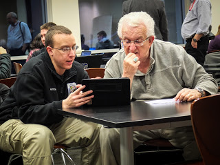
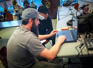
Founder of the Air Force photojournalism program Ken Hackman, right, offers advice during the Visual Media Workshop in Arlington, Va.
Same thing goes when attending workshops, trade shows or conferences. These gatherings can truly offer some inspiration and provide you with ideas or techniques that will help you get better. Challenge yourself to not be overwhelmed and just enjoy the experience of being around lots of creative people. And if you do share, you might be surprised just how many others feel the same way you do.

Beware of intimidation: As you progress and become more confident as a photographer, you will want to share your work outside friends and family. Opening yourself up to that honest critique is hard, nobody wants to hear that they may not be as good as they think they are or that photo you are proudly hanging over the couch is not appreciated by others the same way you enjoy it. As hard as it can be to hear that truth, don't allow yourself to be intimidated by it. Seek out critiques from photographers whose work you admire and that you know will challenge you. Seek out lots of critiques because every one is different too. This how you will grow?

Shane McCoy, a photographer and videographer with the U.S. Marshals Service, provides a critique during the Visual Media Workshop.
I've had critiques early in my career that almost made me walk away from photography and I've had students who came to me in tears and were ready to change majors after receiving a particularly harsh critique. As an instructor it was my role to reassure, but also be honest. I offer that because there is nothing wrong with receiving a harsh critique if along with that you are offered constructive ideas on how to improve. Remember also that sometimes people can just be jerks. That happens and as hard as it is, move on. Sometimes it is because there is not an appreciation for what stage you are at.

I never stop trying to make a better photograph today then I did yesterday. Sometimes you are the only one that likes a particular shot and that is fine. Be proud of your work and don't let the fact that there are numerous "celebrity" photographers all over the web intimidate you or keep you from shooting. Again, if you like the photograph and want to hang it on the wall, then do that.

I recently attended the Visual Media Workshops DC Shootoff and one of the presenters, Lou Jones, who has been taking pictures for decades, looked out at the audience at the conclusion of his talk and said, "I consider every one of you my competition, and I welcome it."

That's a great attitude. Take the pictures that you want to take and realize that not everyone will like or appreciate them, but so what. Just keep shooting and sharing.