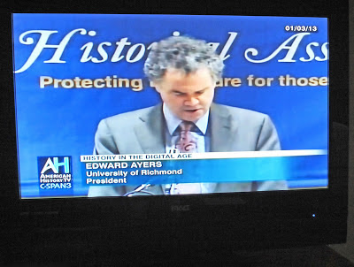
I'm sure the president of the University of Richmond was unaware of what television viewers saw behind him during a C-SPAN3 broadcast of a panel discussion on History in the Digital Age, but it sure caught my eye. Also, I'm sure that no one who was present in the audience that day was aware. And just maybe, if I hadn't put it in the title of this blog, you too would be wondering why I posted this picture?
In all things photography, both still and video, you must always be aware of the background. In this case the Historical Association's banner placed behind the speaker would at first seem like a good promotional idea. But did anyone check what the background would look like when viewed at 16:9 on television? I'm pretty sure they didn't.
In most cases a photographer scans the background looking for a pole or tree branch poking out from behind a head. In other cases it is making sure nobody is flipping the bird or photobombing during an interview.
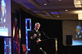
In this blog I'll talk about photographing a conference, something I do quite often, where having a dynamic background, preferably with the conference title, can add interest and help tell the story, and where a poorly designed background can present all types of problems.
1. Take into consideration all the angles that photographers will be shooting from.
2. In backgrounds, size does matter. If too small it will look strange when photographed using a wide angle. Too big and the speaker will get lost.
3. The speaker will get lost if the background is too bright, either by color choice, or over lit by the production crew. If the background is too busy, it could detract from the subject.
4. Keep in mind that the video camera is probably on a riser in the back of the room shooting straight on, while still photographers are shooting from a lower angle.
 |
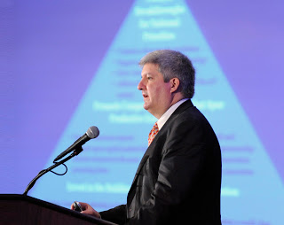
| Video screen showing presentation in background adds graphical interest to otherwise static photograph of Mr. Thomas Kalil, Deputy Director, White House Office of Science and Technology Policy. |
1. Work with the background by varying your angles to add interest. Make it work with the photograph by incorporating or isolating portions. Be selective.
2. If there are video screens off to the side, see if the imagery or graphics can be used to enhance interest. Emphasize patterns in these slides by using a shallow depth of field.
3. If possible find a way to elevate yourself, such as shooting from a riser or using a ladder, to put yourself at eye level. If the background was designed to be viewed this way without many options, then put yourself in the same position.
4. If the background does not work at all, or if there is no background and just a curtain, do your best to avoid leaving a black hole behind the speaker. Shooting from an extreme low angle to include overhead lights or spots can add interest, or shooting from slightly behind the speaker and including the audience is a good idea.


