 |
| When Dr. Robert Ballard, probably most known for the discovery of the RMS Titanic, stepped in front of a screen depicting the future of underwater exploration, I knew I had my photograph. |
In my case, I am responsible for covering ceremonies, conferences, and speakers in our corporate conference center several times a month. Everyone from famous oceanographers, Nobel Prize winners, four-star admirals and generals, authors and scientists have passed through and while the presentations are fascinating, it is the same venue, same light, same big screens, etc. You get the picture.
In this post I'll focus mainly on covering speakers and presentations as opposed to events. So how do I make that interesting or different when I've been shooting in this location for eight years? Well read on.
In this post I'll focus mainly on covering speakers and presentations as opposed to events. So how do I make that interesting or different when I've been shooting in this location for eight years? Well read on.
On the surface it would appear that nothing changes expect the person and that would seem like the big disadvantage, right? Not really. Your first advantage is that the basics of the environment doesn't change, which means your exposure doesn't really change. I know that I'm going to put my camera on manual with a shutter speed of 100, f-stop around 3.2 and an ISO of 1600. Now that might change just a bit on occasion depending on whether the speaker remains in the front of the room or moves around. But in any case it will only change a stop or so in either direction.
 |
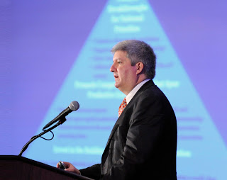
| It wasn't until the final slide of his presentation, which featured the cover of his new book, that I felt I had a usable photo of Dr. Peter W. Singer. |
The second advantage, and this will save you time in post processing, is you can assign a custom white balance and forget it. As I'm walking up the stairs to our conference center, I set my camera as stated above and make sure that my camera's white balance is set on custom. Now when I enter the room all my attention is on how I'm going to make these images different from the previous ones. All the technical issues were solved years ago.
Which brings us to the title of this post, the fact that you really are shooting the same scene over and over and the changes you are looking for can be subtle.
 |
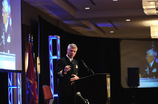
| The dark slide behind former Chief of Naval Operations Adm. Gary Roughead provided nice contrast with his uniform. |
More than 90% of the speakers have some type of Power Point slides or video they use during the presentation. You can use those slides to your advantage. Since I am able to include a large video screen in my frame whether I'm shooting from the left or right, I wait for a slide that in some way works visually with the speaker. It could be a graphic or have strong color and because you control the depth of field, it is your decision on how much you want the viewer to know. If it's the title slide or has words that help identify the speaker, then a little deeper depth of field is the answer, or if it is a graphic element or strong color, then shallower normally works.
 |
| Professor and complex network theorist, Dr. Albert-Laszlo Barabasi, had some complicated slides so I opted for a shallow depth of field and waited. |
In one sense I'm fortunate that I have those video screens to use since they do provide endless opportunities. So what if you don't have anything like that? If that was the case, I would most likely place a colored gel and strobe the background to add some punch. Or maybe place some temporary art on the wall that you are confident you could use as visual elements. That's assuming this is a space that you control.
I realize every venue is different, so the key is to figure out all of the basics first, such as shutter speed, white balance and f-stops. The real point is that if you are required to photograph in the same location, then master that location, embrace that location and most of all, be creative in that location. You don't have a choice, right?
I realize every venue is different, so the key is to figure out all of the basics first, such as shutter speed, white balance and f-stops. The real point is that if you are required to photograph in the same location, then master that location, embrace that location and most of all, be creative in that location. You don't have a choice, right?


